This section covers Composition, Rule of Thirds, Negative Space, Styling Starting Points, Cropping & The Colour Wheel
Composition
What makes a good photo? It’s not just a great subject but good composition really makes a good photo. This means deciding what is in your frame and how it appears in your frame. You are in charge of what you want to show the viewer and equally important what not to show the viewer.
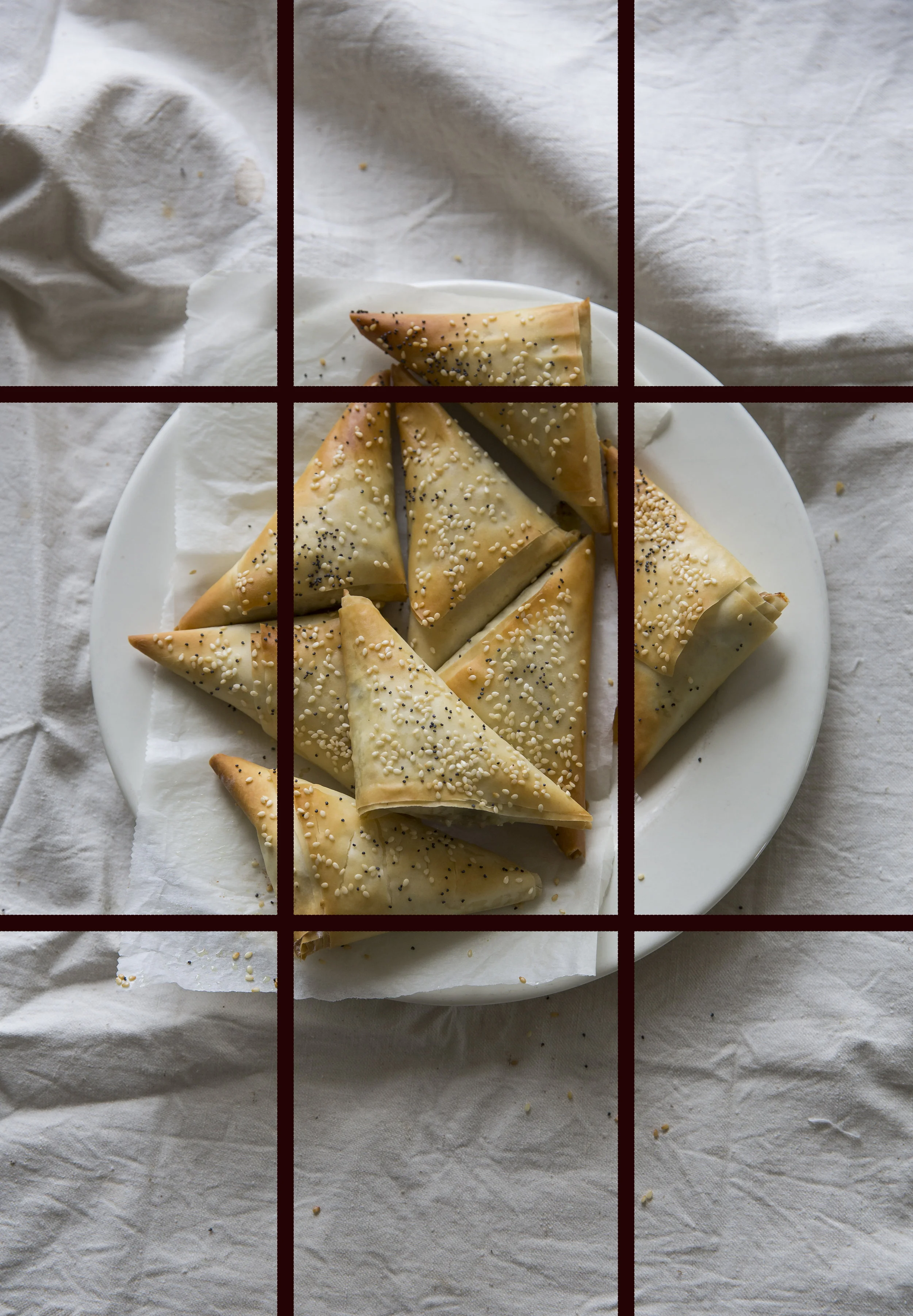
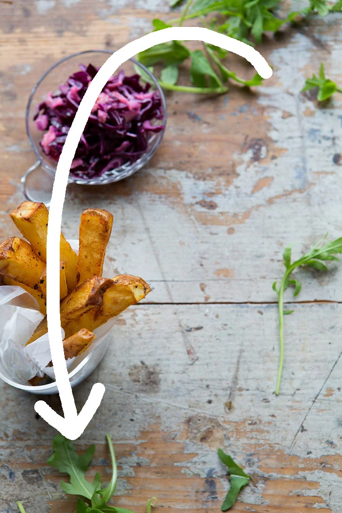
One of the first rules of photography you hear about is, using The Rule of Thirds. This is when you mentally split the frame into thirds. You can also do this physically by adding the grid lines to your iphone or DSLR (I always have these on, it also helps me try and keep my horizons straight!)
The idea being that if you place your hero subject on any of the highlighted lines, particularly where they intersect, it will make your image more pleasing, it will flow, it will FEEL right.
If you place the subject bang in the centre it’s quite jarring to the eye. Particularly with portraits, It’s difficult to articulate but it often just doesn’t FEEL right. And it can often be seen as, dare I say it, boring! Of course all rules are made to be broken but if you start with this theory in mind it will help you get to an end result you are happy with a lot quicker and help solve any frustrations you have about the image not quite working but being unable to figure out why.


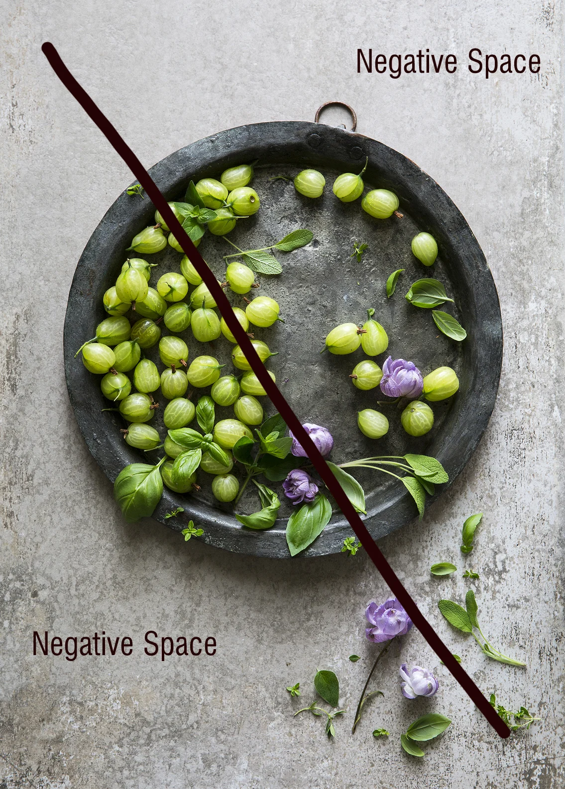
Negative Space
This is about the area or space that surrounds your main subject and what you do with it. You could fill that space with things/props/food or leave it empty. That empty space is called negative space. But it could also mean a boat in the bottom right of a frame and the rest of the image is filled with sky. The sky would be the negative space.
The point of negative space is to allow your hero or subject to breathe. Which probably sounds silly but your eye needs to wander around an image in a way that FEELS comfortable, unconstrained, natural and easy. It’s all very subtle and subsconscious and difficult to articulate because it happens internally as you look at something.
Have you ever looked at an image that makes you feel claustrophobic? I find images that have all the corners and edges of the frame filled with props or elements really claustrophobic, I actually find it difficult to breathe! If this hasn’t happened to you, have you looked at an image that makes you feel calm? Like, as I mentioned above, a landscape image filled with mostly sky with the subject; person, boat or thing placed in the bottom left or right of the frame. Adhering to the rule of thirds and also embracing negative space, that empty sky is like a huge, deep exhale.


Styling starting points.
Sometimes having a blank canvas and all the pretty things waiting to be placed on it can be paralysing… where to even begin!
I don’t really think this way anymore as I work very instinctively (like I mentioned with the driving analogy in the camera basics section). But having a few pre-set layout techniques up your sleeve can at least get you going and the creativity flowing and if it changes completely from where you began at least it gave you the momentum to begin.
Fill The Frame
An easy one to start if your subject is just one thing. As an aside this doesn’t give me the claustrophobic feeling as it’s one subject the repeat pattern and colours (to me) are very soothing and tones of the same colour, again to me, is really attractive. This also has the added bonus of the directions of the leaves which are almost S shaped (which we will come on to next), which helps the eye flow through the image.
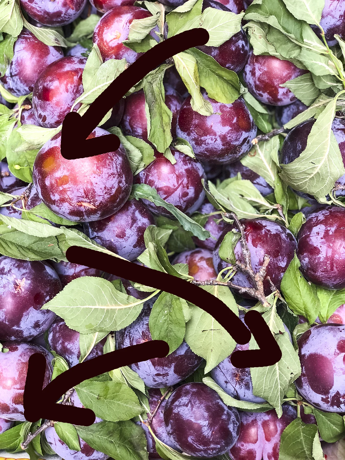
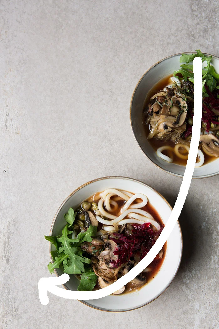
S Shapes & 3 is the magic number
Grouping things into 3s is so, so pleasing, as are circles. If you have three of something it’s generally a great starting point to creating a lovely image. The S Shape is about arranging the elements or hero into an S Shape from the top to the bottom of the frame. The eye is really happy to flow through an image that is created with the S shape in mind. The negative space in the image below also gives an entry and exit point for the eye.


J or U Shape
Following on from the S this is very similar in that you fill the frame following the line of a J or U (and of course the letters can be reversed or upside down!)


On the Diagonal
Placing your hero towards the centre and then following the diagonal of the frame to arrange your props and other elements is another popular way to style an image. You tick lots of boxes by using the rule of thirds in the top and bottom left or right hand sides, as well as keeping negative space to allow flow in the image.

Cropping
Try to create your end result image within the camera, you don’t want to be relying on post production to ‘fix’ things or make your crop decisions then. Of course, sometimes you get the image back on your computer and a nip and tuck really makes the image. BUT for me, I want to be taking photos so the less time I can spend in front of the computer the better.
So be aware of where and how things fall out of the frame, if you have just the tip of a knife or fork creeping in it can look awkward. Elements that are neither in or out of the image look careless or forgotten and are distracting. Just be really aware of the edges of your frame.
The Colour Wheel
If you struggle with choosing colours to style your food or you have a great orange plate you want to use but don’t know what food would work best on it, then google Colour Wheel. Find one that makes sense to you and start getting to know about how colours work together and compliment each other or make another colour pop.
For the first weeks assignment I chose a dried pasta that is very yellow, blue is the complimentary colour of yellow but as that would be too bright for me I used a grey blue tone which still makes the yellow pop.
Red tomatoes would pop on a green background and green herbs would on a red background. If I was styling herbs, red would be too strong for me but a warm wood with red/orange undertones would work really well with the green herbs and my aesthetic.
You could look at the Analogons - which are colours adjacent to each other like blue, yellow, green or Monochromes and just work in different shades of greens or oranges.
If you are stuck trying to make colours work together consult the wheel and see if there is another option or tone that will bring your subject to life or compliment it better.
BREAKING THE RULES
I’ve always disliked being told what to do, at age 5 when all the teachers insisted I had to dot my ‘I’’s I decided not to (and still don’t!). When every told me to keep the lens hood on my lens I never have (I like flare!) and when everyone says don’t place the hero in the centre of the image I want too!
Once you know the rules you can break them, experiment, play, try something new. Feel free to do this once you have the rules firmly in your mind and when you’ve done your go to options, experiment.
For example, you have found the perfect exposure, try over exposing for bright, stark images or under exposing for a moodier feel.
Forget the rule of thirds and see what it looks like if you put everything in the bottom left corner!